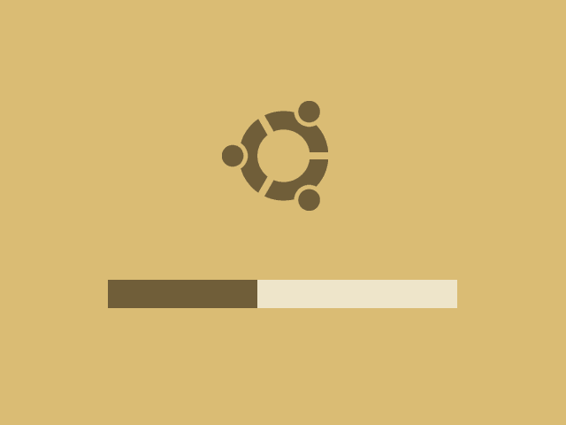
Ubuntu Minimalistic Bootsplash
Introduction
Background
About halfway May 2006 I received an offer via e-mail from Mark Shuttleworth to create a new bootsplash screen for Ubuntu Linux. This bootsplash screen could become the default one for the Dapper Drake release, scheduled for the 1st of June. I tried my best to come up with something usable and aesthetically pleasing while working within the constraints that the usplash software places on the graphics design.
Creating the Splash Screen
Coming up with ideas
Things that I want the new splash to show are strong Ubuntu branding, linked to the colors used in the login screen and the desktop. I'm also a fan of keeping things simple for end users, which means I wanted to drop all unnecessary and possibly confusing screen elements.
I've also noticed that in practice, drawing text using usplash is slow and imposes a bottleneck on the speed at which both my physical machine and virtual (VMware) machines boot. Removing the text would be something I could save for later as I had to patch the usplash software instead of solely supplying new artwork. First of all I had to focus on the design.
What I proposed was dropping the text, and also dropping the black background color for a beige tint which was used in the login screen. On top of that I wanted the Ubuntu circle logo, placed so that the circle is horizontally centered. Below that a solid progress bar.
I created an initial sketch version which looked like this:

The initial sketch for the Minimalistic splash screen.
It looked good on my screen, especially when viewing it fullscreen. But there was a problem, since some LCD or TFT screens do not fully scale the image and show black borders around it. To solve this problem, I added rounded corners to my splash to make it fall back gracefully on non-scaling screens. I posted two example pictures showing both the scaled and unscaled versions of the splash:

Preview images of a working usplash, both scaled to fullscreen on the left and unscaled on the right.
I got a lot of nice reactions on this design, but unfortunately it won't be included in Dapper because it doesn't have a black background. Although my initial testing did not show any problems with machines not booting after installing my splash screen, the fact that a black border could be displayed was a showstopper for the development team.
Download and try it
If you want to check out the splash, you could try this .deb (for i386):
Minimalistic usplash version 0.1 (.deb, 50Kb)
I've also patched usplash to remove all non-critical boot messages. Download the patch against usplash.c here:
usplash cut-verbosity-patch (.patch, 1Kb)
About this article
This article was added on the 18th of May, 2006.


