Rebel Spirits Logo
Introduction
Background
On the 12th of December 2005 I received an e-mail from Kristian Stoyanov, the owner and system administrator of Rebel Spirits, a non-profit Christian community website. He had seen the KDE Kontact logo I designed and asked me if I could work on a logo for his site.
Kristian already had a clear idea on what the logo should look like, but didn't have the time to accustom himself to a vector drawing program like Adobe Illustrator or Inkscape so he asked for help.
The logo should be sleek, crisp and modern and would be used for all kinds of products besides the website, like mini-films, DVDs or video games. Kristian rightfully stated it was very important to set up a good image for the community and a solid logo would definitely be a great start.
Getting it started
I replied the same day I received his offer and let him know I'd do the work for a gentle fee since he didn't really have a really big budget to work with. I fully understood the situation he was in and our cooperation was of to a start.
A few hours later Kristian's reply was waiting in my inbox and that's where the story begins.
First Contact
Sketching the plan
Alongside Kristian's initial mail was a sketch of his logo idea, a water bubble on top of a white surface with whitish lighting falling in from the top left. Accompanied by some notes it looked like this:
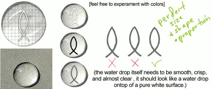
As you can see, it was important to get the shape of the Ichtus fish right, as it forms the foundation of the logo. I did my best at getting it to look just the way it should and I started experimenting with it. After a few days of part time work I sent Kristian my initial sketches:
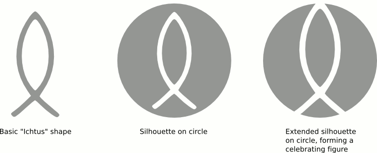
The celebrating figure
You might ask yourself what that celebrating figure means. This is what I wrote about it to Kristian:
"I've managed to work a bit on your logo, starting with a nice vector version of the Ichtus-shape. I fiddled around with it a bit until I got a great concept, please check out the attachment and look for the lower right idea, I think it's perfectly fitting for your intended audience and it shows passion and religion in one go. It also looks great when rotated to either side, a nice bonus in the design."
The "lower right idea" I was referring to is this design:
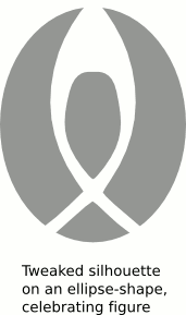
The Ichtus shape is present in it, if you extend the grey shapes in your mind. Anyway, it was just an idea that came up and I wanted to see whether or not it was useful.
In the next reply Kristian sent me it was apparent he didn't think it would be useful, but the silhouette on circle concept was exactly what he wanted. He wrote:
"Sillouette on Circle looks great, the fish logo can be just a tiny bit smaller but i love what i see so far. You deffinately know how to interpret other people's ideas."
OK, so the circle and Ichtus shape would become the definite shape of the logo. I set out to create the water bubble effect with the least gradients possible.
Bursting Bubbles
The first drop
My first, rather unrefined, water bubble concept looked like this:
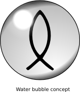
We sent mails back and forth about what areas the logo could be improved. Luckily and fortunately Kristian proved himself to be a decisive man and he would provide me with clear suggestions on how to get the logo more and more to look like what he had in mind.
Water bubble refinery
In a relatively short timespan I came up with the following progressively more refined water bubble logos. These concepts are ordered by maturity, the leftmost one is the earliest refinement, the rightmost one is more definite:
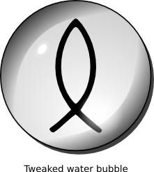
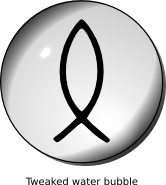
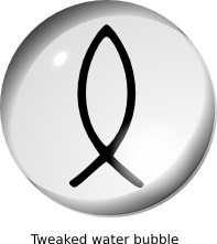
We were getting there, but it still wasn't as good as we'd both liked the logo to be. So I set out to create an even better version.
Final Frozen Bubble
Last changes
What I decided to do was to scratch everything I had come up with already and start over with the knowledge I had acquired during the sketching process. I decided it'd be best to make the bubble mathematically perfect and the shapes should all be at fractional offsets.
It took some courage to start over and to redesign the shapes and gradients, but in the end it was well worth it. The new version, which got labelled final looks like this:

Kristian was happy with it, he wrote:
"It's beautiful.... I think it's ready, honestly. I wanted to use the logo in different ways, so I'll be changing the color of the fish inside, I downloaded the same vector editing application you have, so would it be easy for me to change the color of the fish inside the bubble myself? Other than that, I'm very very very pleased with the results and would like to complete the transaction soon."
His kind words almost overshadowed the question: how could he modify the logo. We both used Inkscape, but he didn't really have the time to learn how to do everything in this tool. I sat down and began to think.
Finishing touches, tutorial time!
I decided it'd be best to create a demo on how to modify the logo, so I fired up Inkscape and started capturing the screen. I added informative balloons and explanations and I demonstrated how to modify the bubble and fish colors.
I sent Kristian this homemade Inkscape tutorial (555 Kb, Windows executable) and awaited his reaction:
"Awesome. Everything reached me successfully and intact. Not only do I love the logo, but the little tutorial you made was great as well..."
Aftermath
At the beginning of May 2006 I received an e-mail by Kristian, he finally had found the time to finish the logo to his own liking and sent me the result. Of course I'm posting it here so you can all see it:

I'm glad the logo found a good home.
A happy end
So after all said and done I had delivered a nice logo and accompanying tutorial on how to modify and export it. I had a great time working for and together with Kristian and I'm looking forward to doing future projects he might have.
The website of Rebel Spirits will launch around halfway 2006, be sure to pay them a visit.
This story was added to the site on the 3rd of February 2006, and updated with Kristian's final version of the logo on the 10th of May, 2006.


