Glacier Logo Design
Introduction
Background
This article will be about the logo design of a software application called Glacier. Glacier is one of my own open-source projects, it's a firewall and load-balancer for network connections. Although I did not really come up with a logo yet, I did design a nice branding graphic. You might have already spotted it on the homepage.
I used a combination of Inkscape, The GIMP and Blender to come up with a few designs. I started sketching in Inkscape but I ended up with a rasterized image rendered using Yafray, I'll try to explain how this ever happened and what decisions I made during the process.
The ideas behind the logo
The ideas I wanted to express in the logo were related to the architecture of the Glacer application. Glacier's built in a layered form, where each layer adds new functionality to an existing base of functions. What better way to express this using horizontal lines expressing the layers?
Besides that, the application consists of several separated modules which each provide a certain function to the application as a whole. This could be expressed using a kind of seperation into building blocks.
On top of that, I tried to do something with the function of the application: it's a firewall and load-balancer. The first word, firewall, lends itself perfectly to be expressed as a wall of flames, but I'm sure that a lot of companies have already taken part into expressing that idea. So I went the other way and called the application Glacier and made the logo out of ice.
The load-balancing part is ultimately expressed in the logo by having a small tip resting on a solid base, thus balancing the load down to every single available individual piece of the structure.
So, all of this may sound vague and far fetched, but let's look at how these ideas slowly turned into reality.
Sketching The Base
Like an union
I started off sketching a logo in Inkscape, trying to make an infinitely long wall of ice, playing with the name Glacier. I had a concept of the wall being shown close up front, but disappearing into the horizon using a slanted perspective. Sounds a lot harder than my initial sketches turned out:
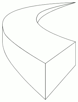
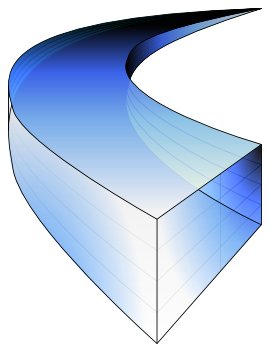
On the left the basic wireframe model I started with, on the right a colored example.
After I had the basic wireframe in place I started fiddling around with coloring the sketch. I tried some different shades of dark and light blue, but in the end I wasn't really happy with any of them. You can see the initial vertical layering I applied in the colored version.
What was next
I tried correcting the sketch a lot of times, but in the end I decided it would be a better idea to start pursuing a different idea. Because I got a bit tired of noodling around in Inkscape I decided to take a totally different approach and I fired up Blender for some relief.
Moving To Blender
The basic idea
While moving to Blender I came up with a new idea: I decided it'd be a good idea to try out modelling small ice cubes and possibly arrange them in a triangular stack. That way, it would convey almost all ideas I initially came up with. I started out by modelling a single ice cube. It looked like this:
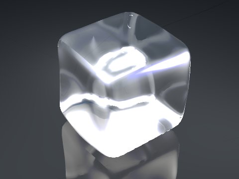
The first prototype of an ice cube, rendered using Blender's internal renderer.
This ice cube doesn't really look convincing yet, but at least it's a start. Looking back there's a lot of areas this ice cube could be improved, but the basic shape is good enough. Improving the rendering later on was only a matter of fiddling around with the material's properties. I decided to arrange the cubes in a stack.
The initial stack
By cloning around the cube, arbitrarily rotating it each step I built a small triangular stack of ice cubes. I didn't really have a masterplan yet for the camera's positiong, but I went ahead and rendered a semi-isometric point of view:
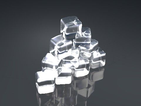
Arranging the ice cubes in a stack, rendered using Blender's internal renderer.
Well, at least I liked the shape of the stack. I wasn't happy with the way the image, the reflections and refractions were rendered, but again I postponed these adjustments knowing it'd work out really well in the end. Next up was setting up the camera.
Spielberg's scenario screen setup
I had the scene almost completely finished, but I wasn't really happy with the camera position yet. I kept in mind that I wanted to create some sort of billboard so I created a setup with a backplane and put the camera right in front of it.
While I was changing around the scene I decided to also switch renderers in between, moving from Blender's internal renderer to Yafray. I changed the lighting and material properties so they better suited my taste. In the end, it came out like this:

The final ice cube stack, rendered using Yafray.
About the final stack
This was something I was happy with. All ideas I had came together in this design and it made up for a nice visual presentation of a billboard. After I had rendered a version with a better resolution, I did some post processing in The Gimp and added the desired text.
I was honestly impressed with the visual quality of Yafray and I'm sure I'll use it again for future projects.
This short story was added on the 26th of February 2006.
Related pages
Check out these pages for more information on graphics design:


