Kontact Logo: Envelope
Introduction
Background
Following the sketches I made earlier, I set out to create an envelope logo for the Kontact Logo Competition. The concept was already worked out, it just needed some finishing touches. In this article I'll try my best to again guide you through the creative thoughts I had when colouring and finishing the logo. Note that the scope of the competition is indeed creating a logo, not just an icon as I wrote earlier. A logo should identify a product at a glance and doesn't need to be scalable in all its aspects.
Blast from the past
To start off, let's look at the last sketch from the previous article.
![]()
The first thing I asked myself again was: is this good enough? It would be a complete waste of time to pursue a concept that was nothing to begin with. Luckily, I still stood by my decision to finish this concept. Well, since we already have a nice black and white version of the logo, what more do we need, and how can I refine this sketch to turn it into a professional looking logo.
Concept Refinement
Welcome to the real world
I won't deny it, I was already confident the logo was good enough for publication, but I had a nagging feeling it could be so much better. The first step in either reassuring myself or having to go back to the drawing board was to test my sketch on other people, real people. I did not have a tape recorder with me, but let me give a universal transcript of the reactions I got.
Me: "Hey, check this [points at the logo] out. What do you think of that logo?"
Reaction: "Well. It's a rectangle with a bird in it. Oh, and a ball."
Me: "Great, if you step backwards a bit and look at the bigger picture, what do you see then?"
Reaction: "Right, I see it. It's not a bird. It's a checkmark in a rectangle, which isn't square. And a ball!"
Me: "Thank you. Maybe one more step backwards?"
Reaction: "Funny, when I look at it from here, it kinda looks like an envelope. And a ball!"
Me: "Thanks again, your comments where really helpful."
The conclusion I drew out of the initial interviews was that the logo was clearer at a larger distance, but it didn't make sense up close. What to do about it, I started thinking of things I could change. After investigating the matter by asking around a bit more, the problem was in the fact that the square was fully white: it was hard to distinguish the top flap of the envelope from the bottom part.
Helping the eye out
To resolve the problem I had to provide an extra visual cue for the viewers who hadn't seen the logo before. I thought of the logo as being right below a glowing lightbulb, so the light fell in from the top. This would make the top flap illuminated while the bottom part would be covered in shadow. Due to the asymmetrical shape of the checkmark I had to find a nice shape for the top flap that would still be easy on the eye.

I came up with the above two grayscale tweaks, both of which looked tremendously more like an envelope than the original. The left one's got an edgy top flap, while the right one has a smooth curve. I decided to opt for the latter one since it's definitely slicker and more pleasing to look at. In the above rasterized images it's hard to tell the differences, but see the SVG sources for close up details.
I again started asking around about the impressions of the new logo. The hit-rate went up and the logo could finally be designated as recognizable. Great I thought, the logo is now in good shape and almost ready for press, if ever.
Bling gone bad
That's no typo, I used the term bling to indicate I was about to polish up the icon and let it really shine in it's basic form using only grayscale colors. I started noodling around in Inkscape to come up with what should've been the greatest envelope you ever saw.

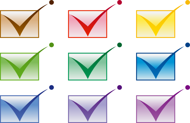
Blinded by my bling-intentions I had completely lost the plot and rushed the logo. To make matters worse, I started colouring the logo and said to myself: cheers to another job well done. Luckily the story doesn't end here, for now let's just look at what I thought would be a great logo and have a good laugh.

Just like a kid in a candy store, you may choose one and that'd be your professional Kontact logo. As I stated earlier, I had gone completely off-track by this point and I just didn't realize it yet. It was late in the night and it was time for bed.
Sidenote: the colors of the logo are from the official KDE icon palette, and it took me quite long to create all logo variations using these colors. Too bad it wasn't worth it in the end.
Color Refinement
Wake up and smell the... ashes
I woke up the next day and when I got to having some playtime in the midday I fired up Inkscape and loaded my "finished" logo to enjoy it one more time before submitting it, or so I thought.
Like an ice cold shower the logo dozed my enthusiasm. It wasn't nearly as I good as my inner feelings told me. All the bling and especially the colors had turned the logo into a low contrast square blob without charisma. Of course, the colors are kind of nice, but colors don't make a logo.
I could've stopped here, it would've been really easy to just submit the logo as it was and have someone else either pick it up or let it silently slide down into oblivion. What I decided to do was the exact opposite: back to the drawing board again to get the matter resolved.
Desaturated design drivel
This paragraph can't go wrong with a title like that. What I did was backtrack to the state the logo had been in before the bling and colors. This was the simple grayscale version I made after the first interviews. The shape of this version was OK, it was recognizable, it just didn't have the punch yet.

I decided to ignore colors for the first modifications and tried to make the logo shine in almost black and white using the grays provided by the KDE icon color palette. If you hadn't noticed yet, the KDE icon grays have a blueish hue which makes working with them more exciting than plain gray. Anyway, I increased the contrast and applied a reverse gradient fade to the top flap, but careful to not bling too much, I also made a version without the gradients.

This looked good. Crisp lines and a nice blueish touch make the logo shine. It wouldn't get any better than this I tought. Maybe you are starting to see an emerging pattern in my thoughts about the logo at each progressive design step. I'm always an optimist!
Not unlike a rainbow
I started to get close to what I wanted, but I couldn't yet get my finger on the fact why the grayscale logo looked so good, while the colored ones are just bland. I set out to explore and resolve this matter once and for all. I created some shiny new reverse gradients and made a tweaked grayscale and aqua version of the logo in the hope it would look finished.

Then it hit me. Squint your eyes and you'll see that although the colors are darker, the aqua logo hasn't got as much contrast as the grayscale version. This problem was simple to solve, I chose one of the darkest grays available in the KDE palette and used them for the envelope outline and the checkmark. I tried creating a nice color scheme for the aqua, blue and yellow base colors. For the yellow, I tried dark brown instead of blueish gray.

BANG! That was kinda like the sound of the logo crashing in on your retina.
Bling it on!
That's no typo in the paragraph title, let me elaborate. After looking at the three high-contrast versions, I decided to go for the middle one since aqua was too saturated and yellow too bright. The blue one also has a nice professional touch to it. Being happy with the logo as a whole, I decided it was time to make a small showcase out of it to present the logo to the masses. What better way than to use some soft shadows and reflections?

Scalability
Anyone can make something that looks big and nice when it's, well, big... And nice. Since the Logo would also have to be used for icons, I decided to give the logo a run for it's money. I tried scaling the logo without the ball and cropping the checkmark.
![]()
It looks good, though I manually retouched the smaller versions' borders to make them crisp. Otherwise, the logo is still recognizable even at 16 x 16 size. I also tried to add the ball and make icons of the logo.
![]()
With a slight bit of retouching, these icons look very useful, too. It took a few hours to experiment with scalability, but I think the results are worth it.
And the clock says?
Now that I had finished the envelope, I decided to work out the clock shape as well.
![]()
Show me more money
Interested in the SVG sources of all steps? Head over to this page!
This article was initially written on the 18th of August 2005, with a direct relation to this previously published article. I added the Scalability paragraph on the 25th of August 2005. The colored Clock logo was added on the 31st of August 2005.


